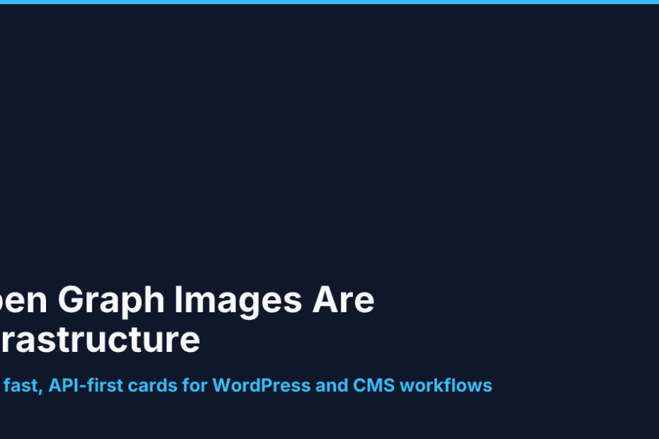
Most people think of images as the “creative” part of a webpage. For Open Graph images, that mindset causes problems.
An OG image is not a poster, a concept sketch, or a brand campaign visual. It is a distribution asset. Its job is to appear correctly when a link is shared on X, LinkedIn, Facebook, Slack, Discord, messaging apps, and whatever preview system your audience happens to use that week. In practice, that means the best OG image is not the most artistic one. It is the one that is readable, consistent, and easy to generate every single time.
That is why I like og-image.org. It is positioned as a free, API-first, client-side Open Graph image generator, with zero data upload. That combination turns preview-image creation from a design task into a publishing task. If you publish regularly, that distinction matters.
Social preview cards are a publishing problem
When a site publishes one article a month, it can survive a lot of manual work. A designer can open a template, adjust the text, export a file, and move on.
But the moment you publish often, that workflow starts to break down. Every new post becomes another one-off design request. Every new headline risks being too long. Every campaign card has to be cropped, resized, or regenerated. And every manual change creates the same hidden cost: someone has to decide whether the preview still looks good enough to ship.
That is not really a design problem anymore. It is an operations problem.
Social preview cards work best when they behave like metadata. They should be generated from the same title, subtitle, brand colors, and template logic that already power the page. If your post title changes, the image should be able to change with it. If your site has a new campaign category, the preview should support it without a new hand-built asset.
That is the kind of workflow og-image.org is built for.
What og-image.org actually gives you
The official site describes og-image.org as free, API-first, client-side, and zero-data-upload. That matters for a simple reason: it lowers the cost of making a good social preview.
You do not have to start from scratch.
The docs expose a small but useful set of endpoints:
GET /api/ogfor rendering OG images from template parametersGET /api/templatesfor listing templates and defaultsGET /api/backgroundsfor browsing curated backgroundsGET/POST/PATCH/DELETE /api/my-templatesfor saved templatesGET/POST/DELETE /api/favoritesfor saved background preferences
That endpoint structure is a clue about the product’s real purpose. It is not trying to be a general image editor. It is trying to be a reusable image system.
That is the difference between a tool and a workflow.
Why 1200×630 matters more than novelty
The other reason OG image generation works so well is that the format is already standardized.
The official size guide recommends 1200×630 as the default OG image size. That is boring, and that is good. Standardization reduces the number of decisions you need to make. It also reduces the odds that a preview card gets cropped badly, compressed badly, or rendered inconsistently by a platform scraper.
The practical takeaway is simple: use one proven size and design for the safe area.
If you are trying to make an image that survives social preview compression, you want:
- One clear headline
- One short supporting line, if needed
- A simple layout
- High-contrast text
- Generous padding around the edges
That is much easier to do when your tool is designed around a fixed OG image workflow than when you are improvising a custom asset for every post.
In that sense, og-image.org is not just a generator. It is a guardrail.
A simple workflow for teams that publish often
The most useful OG image workflow is also the least glamorous:
- Write the post title and excerpt first.
- Pick a template that matches the page type.
- Feed the title, subtitle, and brand settings into the generator.
- Export a 1200×630 PNG or JPG.
- Add the image to
og:imagemetadata. - Validate the preview before publishing.
That process works whether you run WordPress, a static site, a headless CMS, or a custom publishing pipeline.
For WordPress users, the value is obvious. The post title and excerpt already exist in the editor, so the image should be generated from the same source of truth. Instead of asking a designer to rebuild the preview by hand, you can automate the whole thing around the metadata you already maintain.
For static sites, the workflow is even cleaner. The build can generate a preview card from frontmatter, a JSON payload, or a page template. The image becomes one more artifact in the release process, not a separate design deliverable.
For marketing teams, the payoff is consistency. A blog post, a product update, a newsletter archive, and a landing page can all share the same visual system without looking copy-pasted.
The API advantage: from manual design to repeatable automation
This is where og-image.org earns its place in a real publishing stack.
The API is designed for static sites, edge functions, and backend automation workflows. That means the generator is usable as part of a build, a CMS hook, or a content pipeline. You can treat image creation like any other automated publishing step.
For example, a post pipeline could look like this:
title + excerpt -> template -> og:image URL -> publish -> validate previewThat is the real advantage over a manual image workflow. You are no longer asking someone to open a design file, choose a background, adjust typography, export the image, and then remember to attach it to the page. The system can do it for you.
You can also use the API to keep variation under control. Templates and backgrounds make it possible to support multiple content types without rebuilding the whole visual system every time. A news post can look different from a product page, but both can still follow the same social-card rules.
This is a better fit for sites that publish a lot of content because it reduces human friction. Fewer steps means fewer mistakes. Fewer mistakes means fewer broken previews.
Where AI images still make sense
This is not an argument against AI images.
AI image tools are useful when the goal is creative exploration. They are great for mood boards, campaign art, abstract visuals, concept sketches, and other assets where variation is acceptable or even desirable.
But social preview cards are different. They are not supposed to surprise people. They are supposed to help people recognize the page quickly and click with confidence.
So the rule of thumb is:
- Use AI images when the image itself is the message.
- Use OG image generation when the image is there to carry the message.
That is why I would not use AI images as the default for recurring share cards. It is not that AI cannot make something attractive. It can. It is that novelty is not the main requirement here. Reliability is.
A practical checklist for shipping better OG images
If you want a simple rollout plan, start here:
- Pick one 1200×630 template as the default.
- Keep the headline short and readable at phone size.
- Use a safe area so key text never touches the edges.
- Generate the image from page metadata, not from a separate manual asset.
- Test the preview on a real shared URL, not just in a design canvas.
- Reuse the same system across articles, product pages, and announcements.
That is enough to cover most sites. You do not need a complicated design system for social preview images. You need a stable one.
If you want one sentence to remember, make it this: preview cards should be treated like infrastructure, not decoration.
Why the cover image matters
The cover image is part of the article’s argument. If the post is about repeatable publishing systems, the preview should look like a repeatable system too.
That is why the selected modern layout works well here. It keeps the composition tight, gives the title room to breathe, and avoids the visual noise that often makes share cards feel more like ads than editorial assets. The image should signal a clear thesis at a glance: this is about structure, automation, and a workflow you can trust every time you publish.
For this article, that is more useful than a flashy scene or a literal illustration. The point is not to impress the viewer with complexity. The point is to make the preview feel stable, intentional, and easy to read when it is reduced to a small card on a social timeline.
Final takeaway
og-image.org is useful because it makes OG image generation feel like part of the publishing stack instead of an isolated design task. It is free, fast, API-first, and built around a standard 1200×630 workflow that makes automation practical.
If you are publishing links regularly, the biggest win is not visual novelty. It is consistency. The best social image system is the one that is easy to repeat, easy to automate, and easy to trust every time a page goes live.
AI images still have a place. They are just not the default answer for social preview cards. For that job, a structured OG image generator is usually the better tool.
