
In Excel, bar charts are the best way to visualize the monthly volume, when you want to show your company's sales over many months or even years. Moreover, you can make horizontal comparisons.Let me teach you how to make a beautiful basic bar chart.
Bar charts make data visually appealing. Hence, while using Microsoft Excel, it is essential to know how to create bar charts.
You can decide to use column charts, bar charts, line charts, pie charts, and much more. The data you want to visualize is usually the primary determinant. In this article, I will teach you how to create a basic bar chart and stacked bar charts.
Utilize Online Resources
You don’t need to be a professional Excel user to create bar charts. There are plenty of free resources online that can help you get started. Tutorials, blogs, and websites such as Chronicles of Data provide step-by-step instructions for anything from basic graph creation to more complex activities like creating a stacked bar chart.
With the help of these resources, you can quickly become proficient at making Excel charts. Now let's dive into several helpful methods you can use to create bar graphs in Excel.
Method A: How to Create Basic Bar Chart
These are the steps to follow when you want to make a bar chart, usually a 2-D column, with the name of the data on one side and the data on the other.
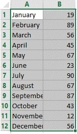
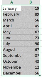
Step 1: Select the data.
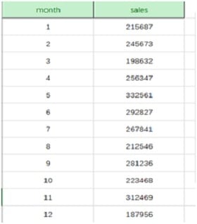
Select all the data that needs to be represented in the bar chart.
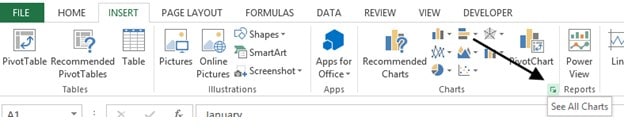
Step 2: Insert the bar chart.
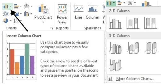
On the top menu bar, click “Insert” and then select “column chart.” There are a variety of chart layouts for you to choose from. You can hover over the style to see the most suitable and click to generate the chart.
Step 3: Adjust the chart.
Just drag the blank area of the chart to reposition it as a whole and place it next to the data so it's easy to see.
You can adjust the length, width, and size of the table. Please do this by clicking and dragging the surrounding box to make it extend.
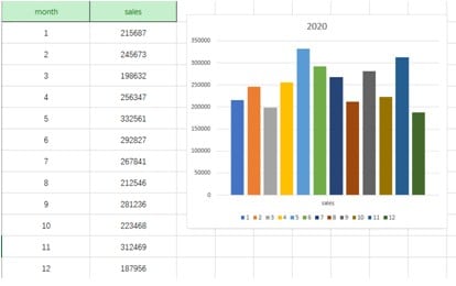
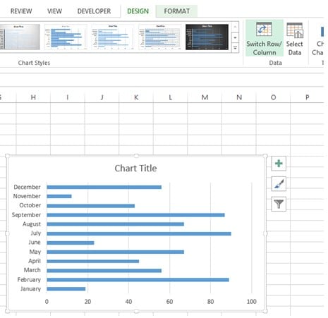
Step 5:Name the bar graph.
Finally, in the Chart Title, edit to “the monthly sales table for 2020”.
![]()
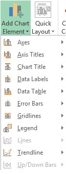
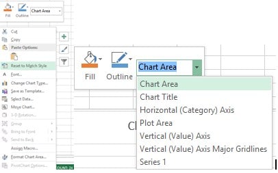
On the top menu bar, click on Design > Add chart element to add other labels.
Step 6: Set chart style
Right-click on any blank area on the chart. From there, you can set the chart style and text style that you prefer,
Method B: How to create a stacked bar chart in Excel
i. How to create a stacked bar chart.
Step 1: Highlight your data in Microsoft Excel.
First, write all the data that you need to represent in a stacked bar chart. When done, highlight all the data.
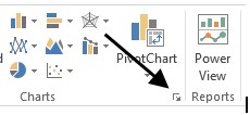
Step 2: Insert the chart.
On the top menu bar, click on “Insert.” Then under charts, click on the more options.
Another window box will appear. Click on “All charts.”
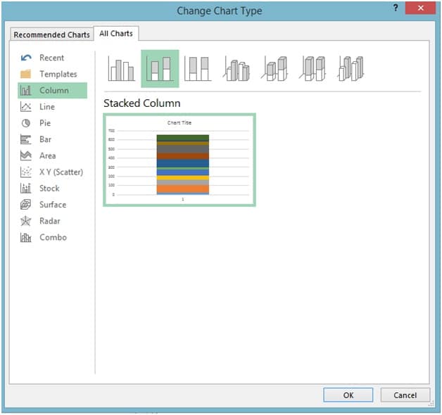
Step 3: Choose a bar graph chart.
Select the stacked bar option. Your data will be represented in two formats.
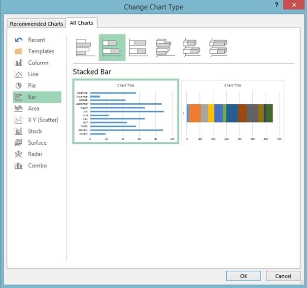
Choose between the two options according to your preference.
Step 4: Modify the design layout.
To switch the design, click on a plan, then switch row/column. This alternates the representation of the data in the chart.
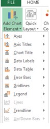
Step 5: Add labels to the stacked bar graph.
To add labels, go to Design > Add chart labels. From here, you can add the titles to different variables.
ii. How to create a stacked column chart
Step 1: Highlight your data
Open your Microsoft Excel spreadsheet and enter the data you want to represent. Highlight the data.
Step 2: Insert the chart.
On the top menu bar, click on “Insert.” Then click“see all charts.” On the Windows box that appears, select “All Charts.”
Step 3: Select Column bar chart
Select the column option and choose the stacked bar. Then click OK.
Step 4: Add labels to the graph
Click on Design > Add Chart Elements.
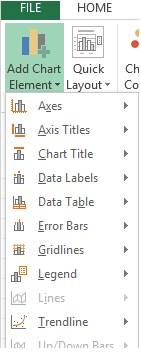
You can add the axis titles, chart titles, and data labels.
Bar charts help to make data simple to interpret. Moreover, it helps to show each category in a frequency for better understanding.
In addition, bar graphs help to summarize large data sets in a visual form. They can be used to clarify trends in the best way possible.